- Zaid’s Newsletter
- Posts
- 8 UX Design Principles for Beginners

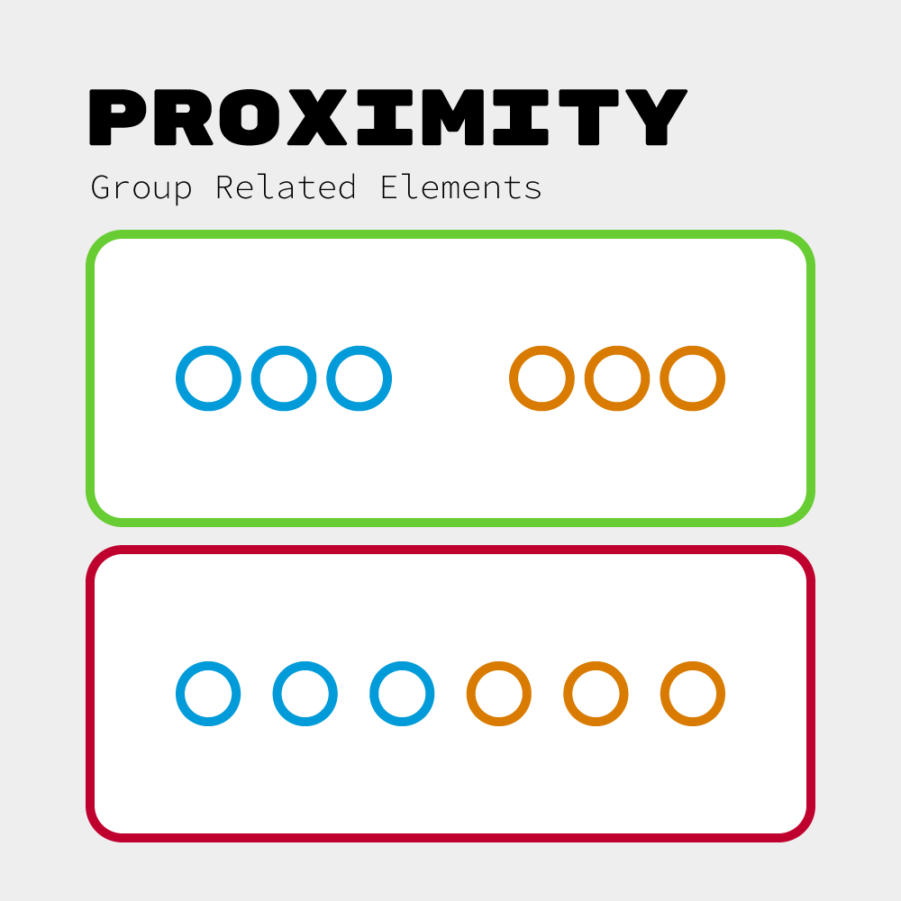
Distance equals relationship. Elements close together form groups; elements far apart stay separate. Our brains automatically cluster nearby objects. Use this deliberately for clarity.
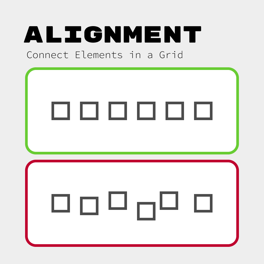
ALIGNMENT: Connect Elements in a Grid
Every element should align to invisible lines connecting to other elements. Alignment creates order. This is one of the biggest differences between amateur and professional design.
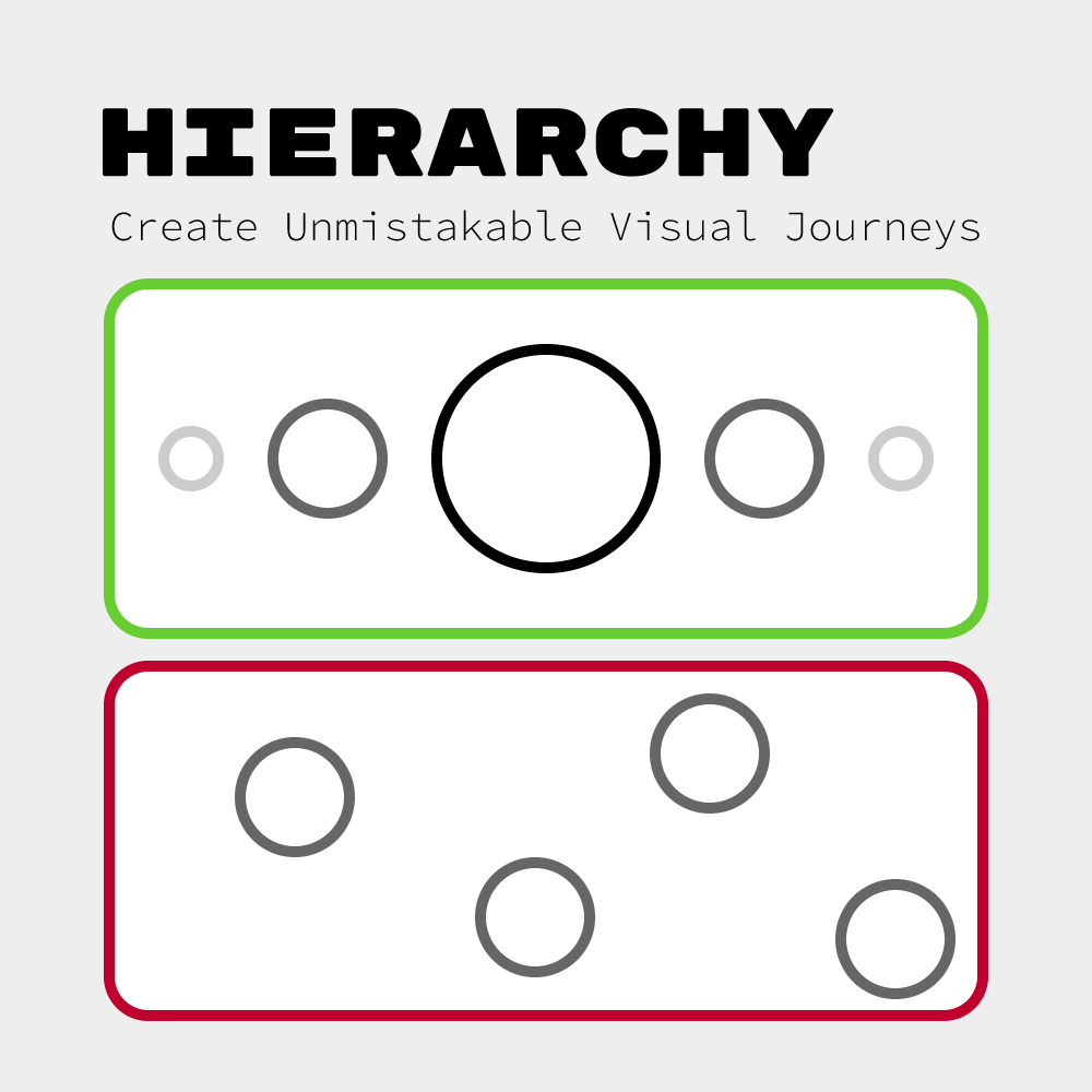
HIERARCHY: Create Unmistakable Visual Journeys
Force the eye to move through dramatic differences in visual weight. One element must dominate. Then create clear steps to secondary information.
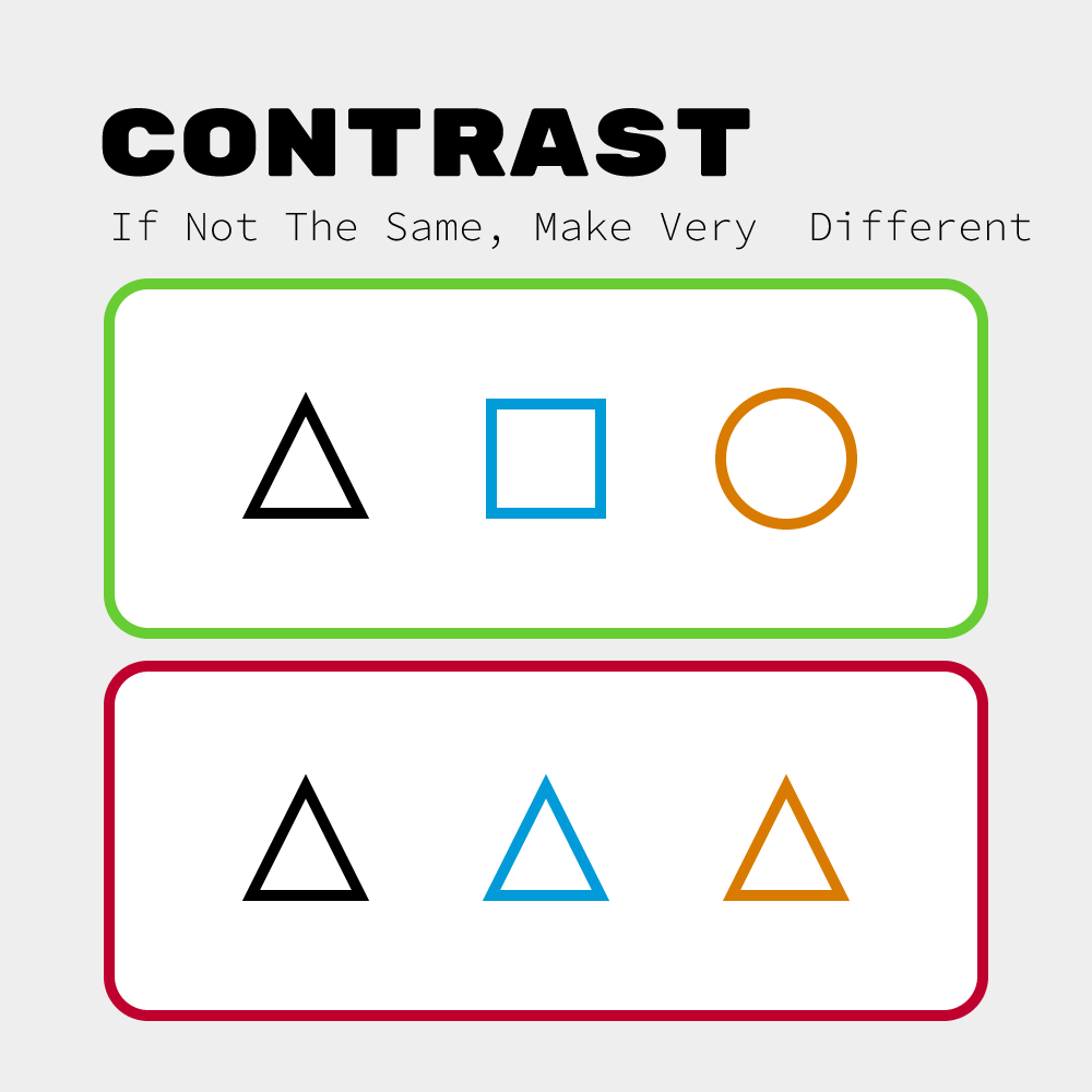
CONTRAST: If Not The Same, Make Very Different
Small differences look like mistakes. Large differences look intentional. If your headline is 18px and body is 16px, it feels accidental. Make it 32px and hierarchy becomes obvious.
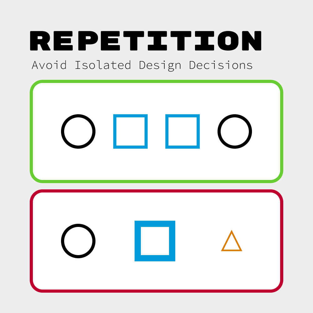
REPETITION: Avoid Isolated Design Decisions
Every visual choice should appear at least twice. A single blue element feels orphaned. Two create intention. Three create a system. If you use rounded corners once, use them throughout.
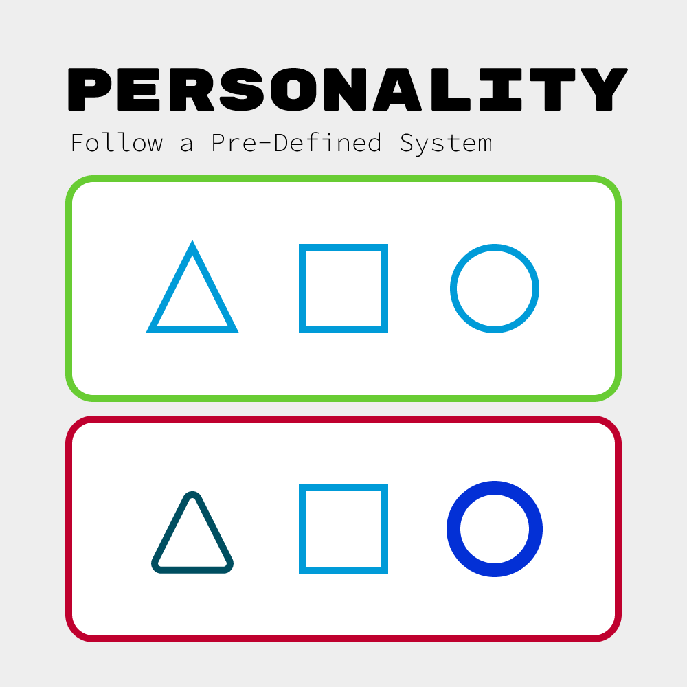
PERSONALITY: Follow a Pre-Defined System
Choose one visual language and commit fully. Soft and rounded everywhere, or sharp and angular everywhere. Never mix personalities—it creates confusion.
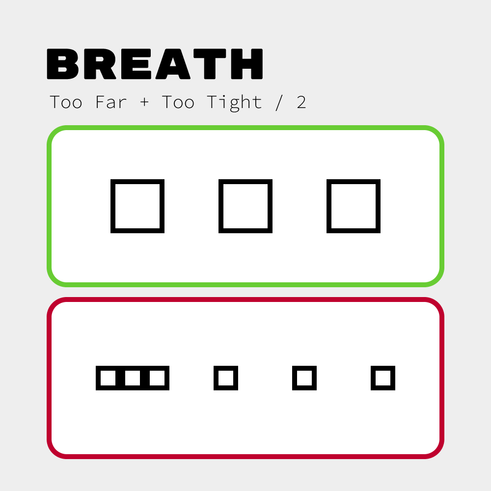
BREATH: Too Far + Too Tight / 2
Space is a design element. Use intentional multiples of a base unit. Elements too close merge; too far lose relationship. Find balance: place too close, then too far, then split the difference.
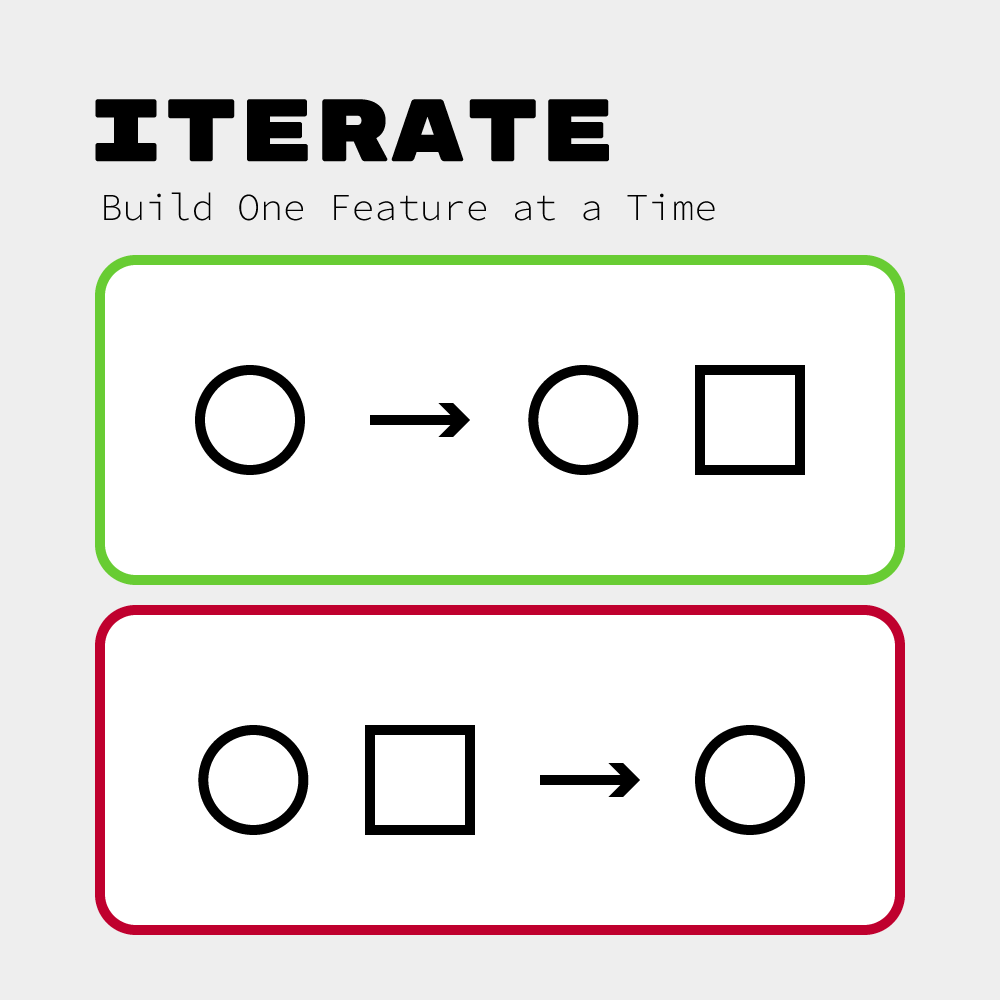
ITERATE: Build One Feature at a Time
Add one element at a time. Perfect it before adding the next. When you add multiple elements simultaneously, you can't identify what broke the system. Start simple—one feature, add the next, balance both, then add a third.
For more on these read “The Non-Designer’s Design Book” and “Refactoring UI”

Reply